
Cultural Identity · Bilingual Digital Experience
Culture withouta single way in.
PASSAGE ممر
A bilingual festival identity and planner: discover, understand, plan and reserve, in English or Arabic.
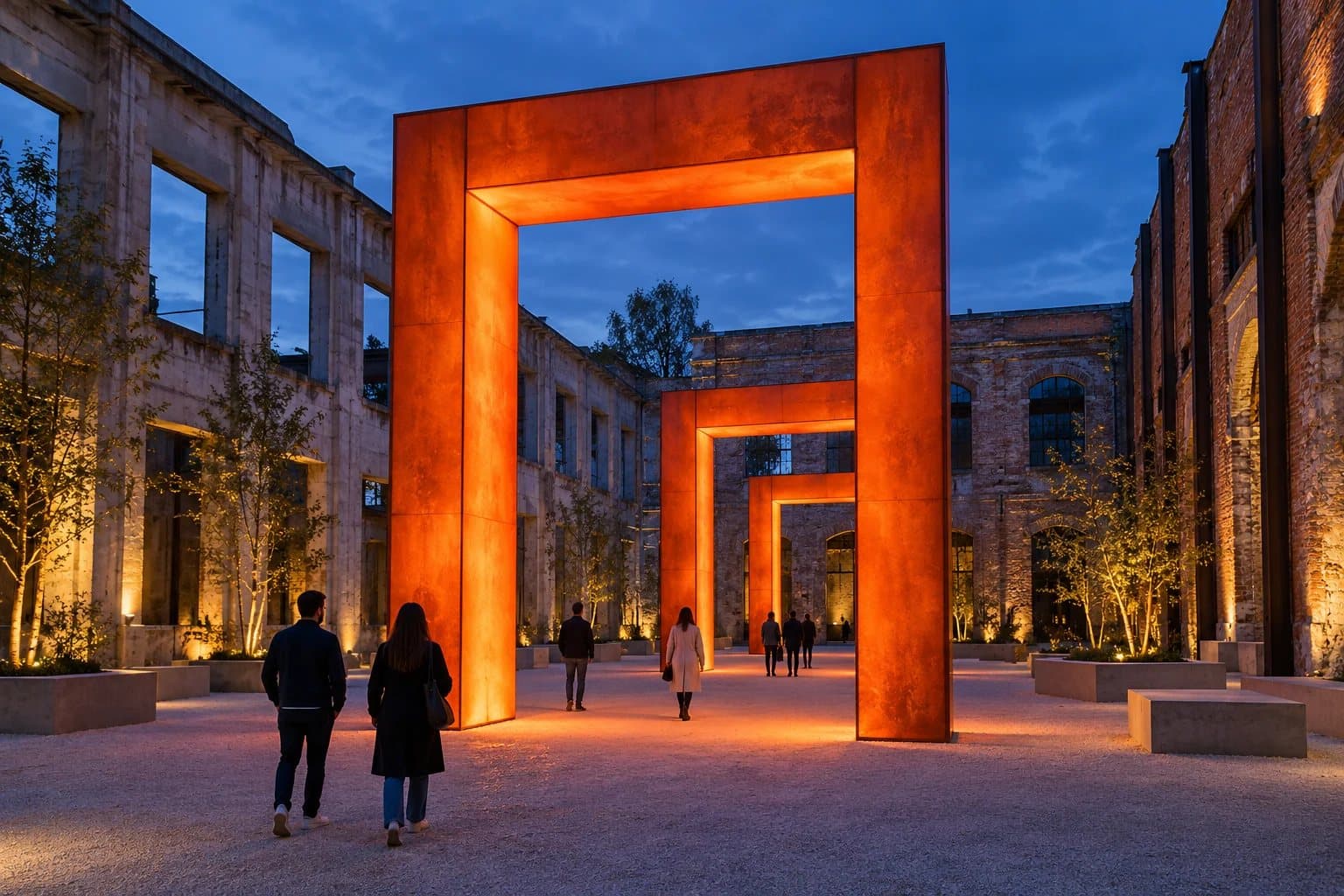
Passage central courtyard featuring interactive light portals and architectural pavilions at twilight.
- Role
- Ibrandify · Design & Engineering
- Scope
- Brand Identity, Bilingual UI/UX, Interactive Planner
- Languages
- English · العربية
- Deliverables
- Full Design System & Web Platform
- Live Experience
- Visit live site
[01]The brief
An invitation first.A useful product next.
Create a cultural experience that feels inviting before a visitor has decided what to attend. The identity can be expressive, but the programme has to stay easy to understand, and English and Arabic share the same content and the same functions.
Experience Architecture
Visitors arrive with different motivations: an artist, a free evening, or pure curiosity. We designed multiple non-linear entry points, all resolving into an intuitive, conflict-aware event schedule.
[02]Identity system
A threshold,not a fixed route.
The portal is the organising idea: an invitation to move between experiences. It becomes the mark, the category artwork and the scene in the hero photograph.
Warm paper and strong ink support reading. Orange brings the energy of the invitation and deep blue gives sound-led experiences a different atmosphere.
Paper
#F3EDDAReading surface
Ink
#20231CText and structure
Threshold
#F0633DInvitation, energy
Frequency
#2439A3Sound-led experiences
PASSAGE
ممر
One identity, two reading rhythms. The mark keeps its shape in both directions; arrows reverse.
[03]The experience
From curiosityto a personal plan.
01
Discover
Curated entry points, day filters, discipline filters and bilingual search.
02
Understand
Time, venue, format, admission and access information before any commitment.
03
Plan
Save experiences, calculate timing conflicts and export synchronized dynamic itineraries.
04
Reserve
Review quantity and price, validate guest details and generate instant confirmations.
The product, as built.
These are renders of the real product component. Switch screens and viewport, and scroll inside the frame.
Choose a screen
Choose a viewport
Day, discipline and text filters combine. Time, venue, format and admission stay visible before an event is opened.
[04]Discovery and planning
Make tradeoffs visible.Keep the choice human.
Filters combine effortlessly across day, discipline, and keyword search with real-time result counts and fluid zero-state resets. Visitors curate personalized schedules with immediate visual feedback.
The itinerary engine dynamically calculates transit buffers between venues, alerting guests to schedule overlaps without restricting their choices, alongside one-tap sync to Apple and Google Calendars.
Dynamic itinerary view with automated conflict detection and venue buffer alerts.
[05]Bilingual structure
Change the language.Keep the context.
The route, selected event and itinerary stay in place. Direction changes; content and functions stay equivalent.
Logical layout
Spacing and positioning use logical properties, flipping seamlessly with reading direction without breaking rhythm.
Mixed-script care
Time ranges are isolated, email fields stay left-to-right, and currency and counts follow strict locale formatting.
Reading rhythm
Arabic gets a bespoke variable font with dedicated line heights and proportions engineered for natural reading.
Cultural Nuance
Carefully calibrated typography and spatial hierarchies tailored to Middle Eastern cultural contexts.
[06]Reservation Experience
Clarity acrossevery touchpoint.
Event details, timing, seat counts, and pricing tiers remain persistently clear throughout the booking journey. The interface incorporates real-time field validation and localized RTL/LTR form mechanics to eliminate checkout drop-off.
Confirmations generate instantly with downloadable passes and calendar sync, ensuring visitors have immediate offline access to their reservations in any festival environment.
[07]Design Engineering
Vibrant energy, flawless legibility.
The primary orange was carefully tuned to surpass WCAG 4.5:1 contrast standards for small category badges over dark ink, maintaining high brand presence while guaranteeing accessibility.
Before · #EB4A25
Art / 18 February
4.20:1
Fails: Below the 4.5:1 target for small text
After · #F0633D
Art / 18 February
4.97:1
Passes: Meets the 4.5:1 target for small text
Calibrated for optimal contrast across all interface states. Tested token pairs: ink on paper 13.60:1 (AAA), muted on paper 5.47:1 (AA), white on blue 9.12:1 (AAA).
[08]System Architecture
Engineered forclarity & scale.
Bilingual Parity
Full 1:1 mirroring across English and Arabic interfaces with bidirectional typography, RTL/LTR layout transitions, and localized data schemas.
Conflict Engine
Client-side intelligent scheduling with transfer buffer calculations, overlap warnings, and instantaneous multi-day plan synchronization.
Accessibility & Performance
High contrast compliance (WCAG AA/AAA targets across all theme pairings), zero runtime layout shifts, and 60fps gesture interactions.
The Outcome
Intuitive discovery, zero cognitive load.
Visitors explore complex multi-day festival schedules effortlessly, building personalized itineraries and securing experiences without language barriers, scheduling friction, or performance lag.
Your project next
Need an identity that works as hard as the product behind it?
Next project
KAGE23 Night-Running App