
Selected Work · SŪRA — Skincare & Wellness
SŪRABotanical care.
A return to yourself.
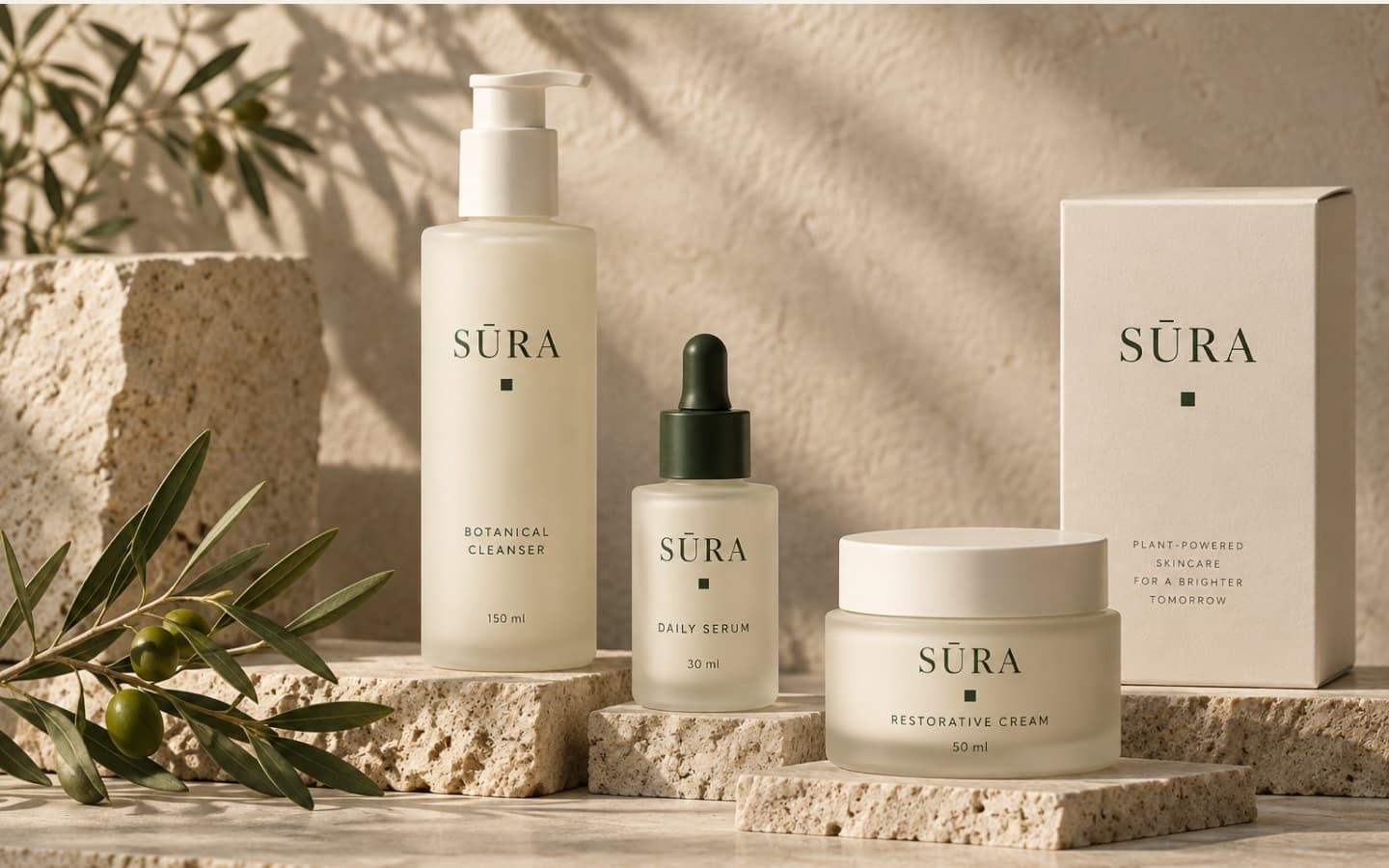
A botanical skincare brand built on the ritual of returning to yourself: tactile packaging, a three-step product architecture, and an intuitive store that turns a daily routine into a considered pause.
- Client
- SŪRA
- Sector
- Skincare & Wellness
- Our Role
- Brand Strategy · Identity · Packaging
- Digital
- E-Commerce Experience
[01]Strategy & Architecture
Make everyday carefeel deeply personal.
The Brief: Bring botanical skincare into a more considered daily ritual, with a distinctive identity and a consistent experience from packaging to digital purchase.
The Challenge
Balance natural warmth with premium clarity.
The brand needed to feel calm and welcoming while giving every product a clear, recognizable place in the range without the clinical coldness common to modern skincare.
Our Response
Build around one idea: return to yourself.
A quiet visual language, a three-step product architecture (Cleanse, Nourish, Restore), and an intuitive store turn that promise into an effortless, coherent customer journey.
Positioning & Narrative
Target audience analysis, brand promise, and establishing 'Return to yourself' as the guiding compass.
Wordmark & Visual System
Refined serif wordmark with the signature macron, architectural square motif, and calming type hierarchy.
Packaging & Commerce
Three-step ritual label architecture, sustainable box structures, and intuitive direct-to-consumer store.
Guidelines & UI Assets
Comprehensive design system, production dielines, and modular component library across physical and digital.
02 / The Brand Idea
Return toyourself.
Botanical care as a small, restorative pause. Less noise, more intention—expressed through tactile materials, spacious composition, and language that feels human.
Rooted in nature
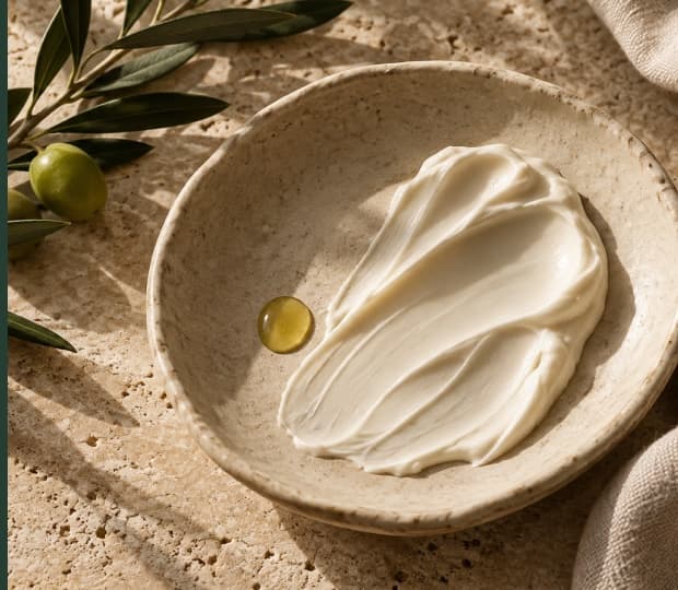
Warm mineral tones and botanical cues create a grounded, sensory world that honours botanical ingredients.
Calm by design
Space, hierarchy, and intentional restraint give every detail a clear, unhurried purpose.
Clear at every touchpoint
A shared product and verbal language connects the label, the shelf, and the digital screen seamlessly.
[03]Visual Identity
An identity withroom to breathe.
A refined serif wordmark creates recognition without excess. The macron is the signature detail; a small botanical square anchors the system across physical and digital applications.
SŪRA
Botanical Care / Return to Yourself
Custom character spacing with botanical grounding square.
SŪ
SŪRA · Botanical Care
Used across jar lids, mobile icons, and packaging seals.
Aa Bb Cc Dd Ee
A little more intention.
Primary editorial serif for headlines, narrative promises, and packaging nomenclature.
Inter Variable
A clear, confident supporting voice for product specifications, ritual steps, ingredients, e-commerce cart, and digital interactions.
Measured Mineral Palette
[04]Packaging Architecture
A clear ritual,beautifully packaged.
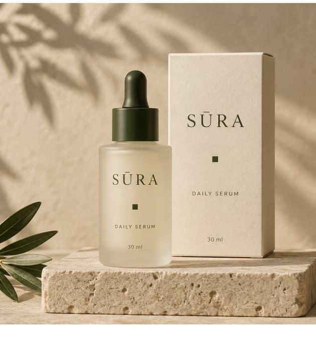
One information architecture gives every product a place: brand first, product second, ritual step third. Material warmth and precise typography carry the identity into the hand.
Packaging / Three-Step Ritual
CLEANSE
150 mlNOURISH
30 mlRESTORE
50 mlBrand → Product → Ritual
A repeatable label structure makes the range easy to navigate while preserving a quiet, premium presence on the vanity.
Consistent wordmark and square make the family recognizable.
Ritual numbers and clear names create a simple range architecture.
Ivory surfaces and considered spacing express care before first use.
[05]Digital Storefront
From shelf to screen,one continuous story.
The store translates SŪRA’s quiet character into an intuitive path: discover the ritual, understand the product, and choose with confidence. Brand expression and useful information work together.
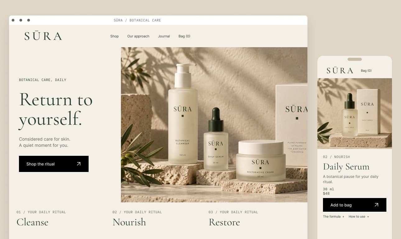
A single brand promise and a clear primary action ('Shop the ritual') establish the first step without cognitive friction.
Product name, ritual step number, volume, and formula information support confident selection and transparent dosing.
The same hierarchy adapts effortlessly to compact mobile screens, keeping the purchase action and ingredient details easy to access.
06 / The Complete System
One considered system.Every touchpoint.
A shared visual and verbal language brings the identity, packaging, and store together—so SŪRA feels recognizable wherever the ritual begins.
Identity
- Primary serif wordmark with signature macron
- Secondary botanical monogram (SŪ)
- Custom typographic hierarchy (Serif + Inter)
- Warm mineral color palette
- Botanical square graphic signature
Packaging
- Three-step label hierarchy (Brand → Product → Ritual)
- Frosted glass containers & soft-touch caps
- Sustainable textured paper stock cartons
- Tactile blind debossing details
- Production dielines & print specification
Digital
- E-commerce storefront (Desktop & Mobile)
- Ritual navigation & bundle builder
- Product clarity drawers & ingredient highlights
- Frictionless checkout experience
- Modular UI asset library
Start a conversation
Designed with intention. Built to be remembered.
Have a brand, packaging, or digital commerce project that requires care and clarity?
Next project
PACT: Purchasing & Approvals